
What Does a Boutique Hotel Actually Need on Its Website?
Fewer pages than you think, and better answers than most hotels give. A guest needs to see the rooms, understand what a stay is like, know the price and the location, and book without friction. Everything else is secondary.
- For
- Opening, Running
- Published
- Reading
- 4 minutes
- By
- Aeterna Works
Most hotel and villa websites are built from the same template: a slider of wide pool shots, a welcome paragraph, a rooms page with a price table, and a button that sends guests off to a booking platform. They look fine. They just do not do much.
A boutique hotel website has one job: help the right guest decide to stay, and let them book directly. Everything on it should serve that, and anything that does not can go.
What guests are trying to decide
Before planning pages, it helps to remember what a guest is actually doing on your site. They are usually comparing you with two or three other places, often on a phone, often in short visits. They want answers to five questions:
- Is this place for me? The feel, the setting, the kind of guest who stays.
- Can I afford it? A real price, not "contact us for rates".
- Where exactly is it? And how far it is from the things they care about.
- Is it available for my dates?
- Can I trust it? Reviews, real photographs, a way to reach a person.
A site that answers these quickly gets bookings. A site that makes guests hunt for them sends those guests to a booking platform, where your listing sits next to fifty others and a commission is taken.
The pages that matter
Home. One strong photograph, one sentence about what the place is, and a clear way to check dates. The home page sets the feeling. It does not need to say everything.
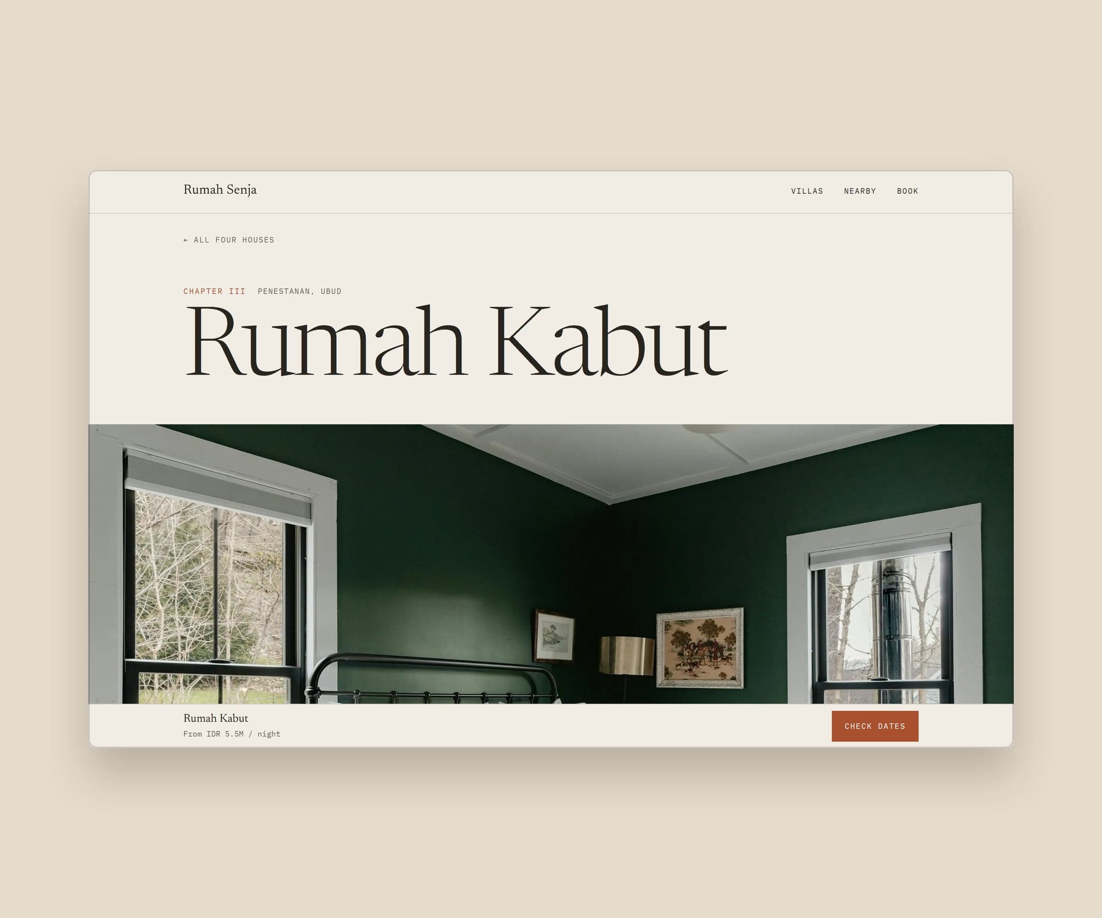
Rooms, one page each. Each room or villa deserves its own page with plenty of photographs, the bed setup, the size, the view, what is included, and a price from. Guests booking a boutique place are choosing a specific room, not a category.
Location. Times, not adjectives. "Eight minutes on foot to the beach" is useful. "Close to everything" is not. A simple map and a few honest notes on the area do more than a paragraph about paradise.
The experience. Food, wellness, activities, the garden, whatever makes a stay different. Show it with photographs and short text.
Booking and contact. A booking engine, a WhatsApp link, or both, visible from every page. Make it obvious that booking direct is possible, and if it is cheaper or comes with something extra, say so.
Policies and questions. Check in times, children, pets, transfers, cancellation. Guests will ask anyway, so answer here and save your staff the messages.
The booking path is the website
Everything else on the site exists to get a guest to the booking step and through it. A few things make the biggest difference:
- Show prices. Hiding them does not make a place feel more exclusive. It makes guests leave to find them elsewhere.
- Keep the booking button visible on every page, and especially on phones.
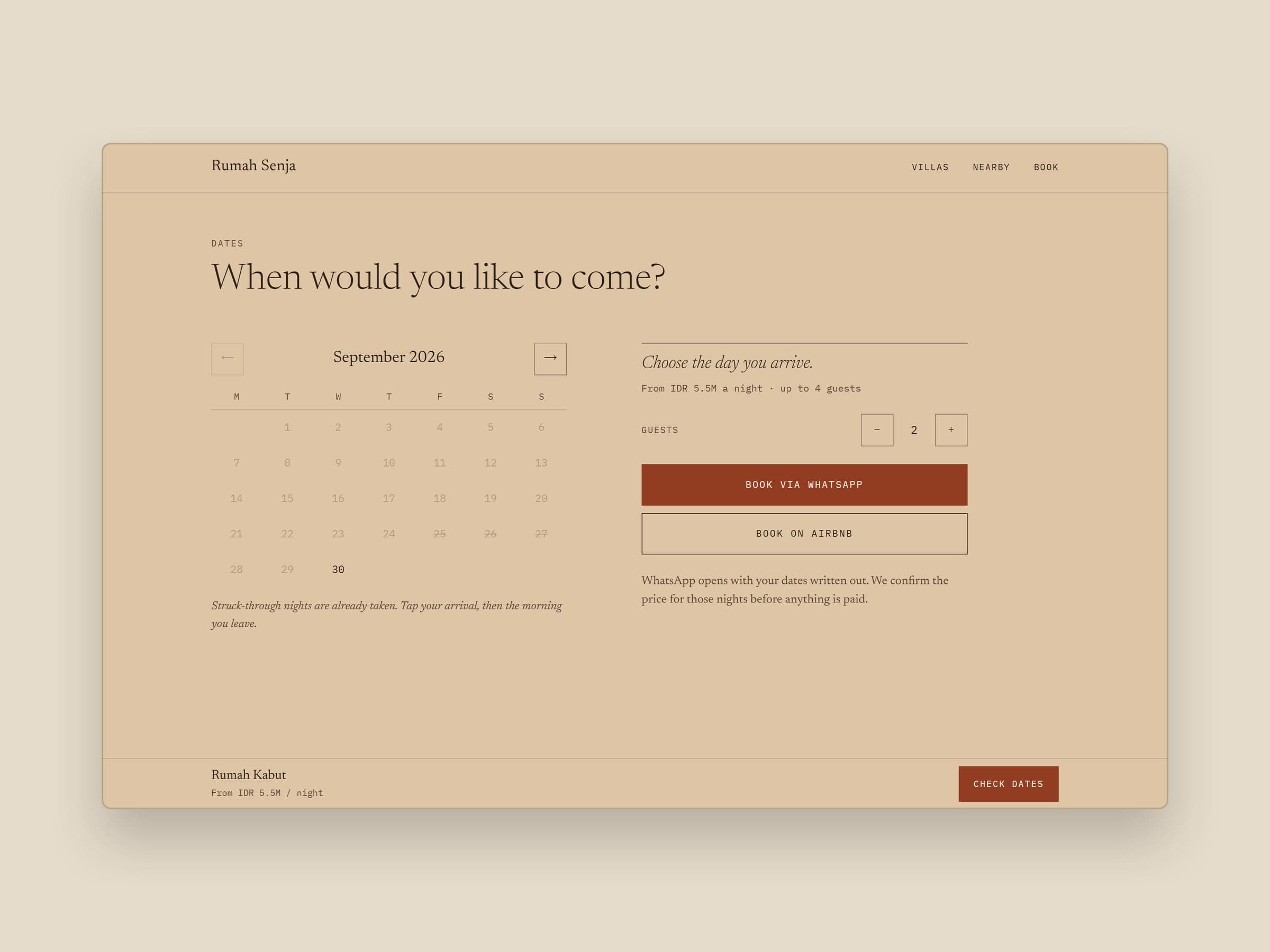
- Pre-fill what you can. If a guest picked dates on a room page, carry them through to the booking step.
- Offer a person. Many guests in Bali would rather book over WhatsApp. A message that already contains their dates and guests removes most of the friction.
- Do not send guests away. A link to your Airbnb or Booking.com listing feels convenient, but every guest who books through it pays the platform, and you lose the direct relationship.
When we designed Rumah Senja, a concept site for four imagined villas, the booking flow was the core of it: a date picker that shows taken nights and writes the WhatsApp message for the guest.
Photography carries the site
A boutique hotel sells a feeling, and guests judge the feeling by the photographs. No layout can rescue weak images. Before spending on design, make sure the photography is right: finished rooms, real light, details as well as wide shots, and people where it helps.
If the property is not built yet, 3D renders can carry the site until it is.
Design for the phone first
Most guests will first see your site on a phone, often from Instagram or a search. Check every page on a phone before you sign it off, and book a room yourself on one. If it is awkward for you, it is awkward for every guest.
What to leave out
- Sliders that rotate before anyone can read them
- Video that plays with sound
- "Welcome to our website" paragraphs
- Stock photographs of beaches that are not yours
- Menus as PDF files, which are hard to read on a phone
- Chat widgets that cover the booking button
- Long loading animations before anything appears
The quiet things that matter
Speed. A slow site loses guests before they see a photograph.
Consistency. The name, address, phone number and photos should match across your website, Google Business Profile and booking platform listings. Mismatches confuse guests and search engines.
Your own domain and email. A Gmail address on a hotel website costs trust.
Search basics. A clear page title for every room, descriptive text, and an address Google can find.
Website brief checklist
- One sentence that says what the place is and who it is for
- Finished photographs of every room, the common spaces and details
- A page for each room or villa, with a price from
- Location described in times, with a map
- Booking engine, WhatsApp, or both, visible on every page
- Policies and common questions answered
- Same name, address and photos as your Google profile and listings
- Your own domain and email address
- Tested on a phone, including a full booking
If you already have a site and are wondering whether to replace it, read what should actually change in a hotel website redesign first.
From the studio
If you are briefing a new website, or wondering why the current one sends guests to Booking.com, write to us. We are happy to look at it with you.